As one who designs for Facebook pages of small- to medium-sized brands on a daily basis, I often find myself skimming the social networking world for new trends, fresh ideas, and inspiration. The creative designers behind the social media of top brands often blow me away with innovative creativity and envelope-pushing ideas. Designmodo recently published an article showcasing some of these incredible fan pages, such as Oreo, Coca Cola, Dunkin Donuts and Nutella.
Besides having incredibly delicious products, these brands are doing social right, especially from a design perspective. Nutella’s mouth-watering breadcrumb trail leads hungry cursors directly to the “Like” button, which top brands understand is a chief priority. And there is no doubt that the infamous pink and orange Dunkin Donuts logo will pop right out on my cluttered news feed, a successful and effective technique. More and more businesses are catching on: you have no choice but to utilize Facebook’s platform to its fullest extent, or you’ll find yourself much further down your fan’s news feeds.
With this in mind, a designer must think beyond the common profile image and–for the more savvy social media gurus–the landing page. Facebook design is about standing out wherever you can. With that said, here is a list of concepts and conventions that aren’t always at the top of the priority list— without paying attention to the smaller details, you might as well try building your fanbase on Match.com.
 Which of these thumbnails pops out at you? When Facebook users race through down their news feeds, that’s the name of the game. Having an attractive profile picture that allows for an eye-catching thumbnail can mean more visits to your fan page and more interactions on your posts. Brands like Urban Outfitters make use of their most compact logos for easy recognition and typically keep their thumbnail consistent to avoid confusion. In many cases, your thumbnail is your first impression; make sure you make it a good one.
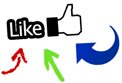 We all like “likes,” and often users end up on a business page and aren’t sure what to do next. Give your potential fans a push and direct their cursor over to the “like” button. Be simple and minimal: give the illusion that there’s something waiting on the other side, a digital “fan club,” in a sense. GameStop has a very effective “nonfan” page, featuring an inviting “like us” direction, a clean design, and a small bit of info about what to expect on the other side.
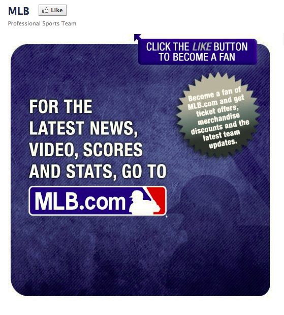
Don’t feel bound by the 520 pixel-wide page tab area and the awkwardly elongated profile image. The Facebook platform allows for plenty of whitespace to get creative. Use the rectangular restrictions to your advantage and give the illusion that you control the space. For example, Mountain Dew’s soda can profile picture looks like a refreshing soda placed atop the navigation, definitely breaking the traditional rectangle. MLB creatively “pops out” of the whitespace and utilizes an effective and creative technique. There are plenty of ways to take your page from a two-dimensional snoozer to an eye-popping, creative fan destination.
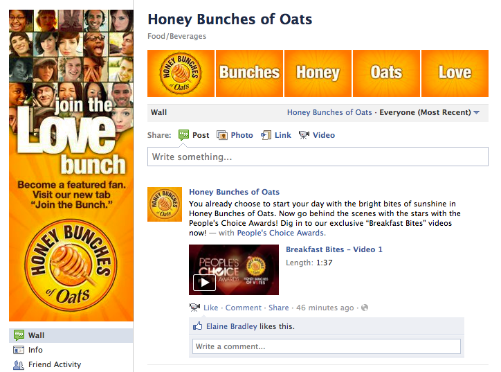
On Facebook, it’s all about the details. Branding everything you can makes you appear professional and credible. For example, taking advantage of the five-picture image banner at the top of your wall is a great way to show off some creativity, show off product, or make a bold message. Honey Bunches of Oats’ image banner boldly states words such as “Love” and “Honey” in a random order, a clever effect. It’s also a good idea to brand your page tab icons. Coca Cola has a custom icon for almost every page tab, giving you a small visual hint as to what to expect.